Chart types
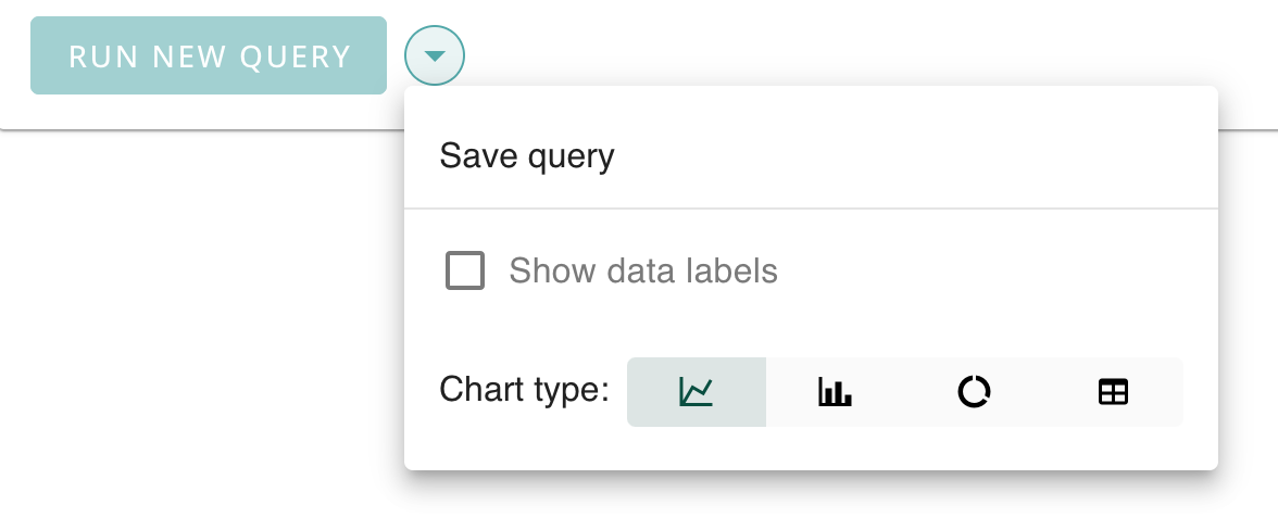
CodeMetrics supports a variety of chart types to help you visualise your data.
The supported chart types are:
Select the chart type that best suits your data and the story you want to tell.

Chart types
Line chart
Line charts are used to show trends over time. They are particularly useful for showing changes in continuous data over time.

Bar chart
Bar charts are used to compare different categories of data. They are particularly useful for showing changes over time or comparing different groups.

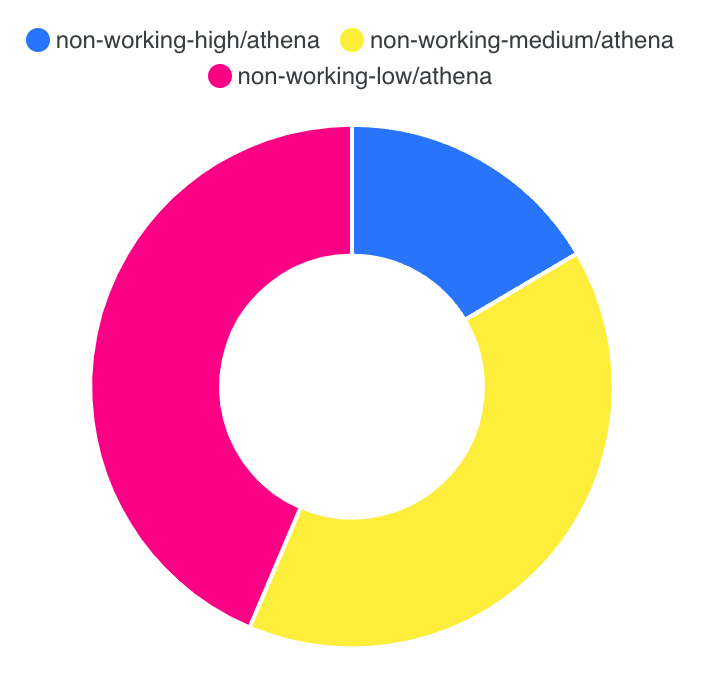
Doughnut chart
Doughnut charts are used to show the proportion of different categories of data. They are particularly useful for showing the distribution of data.

Table
Tables are used to show data in a tabular format.

Other features
Data labels
You can enable data labels on your charts. This can be useful for showing the exact values of the data points on the chart.
Exporting data
You can export the data used to generate the charts in CSV format. This can be useful for further analysis or sharing the data with others.